Now that the Dolphins are officially out of the playoff hunt we can start looking forward to the future. After we beat the Pats next week and before the draft one big item needs to be talked about… the new logo. Mike Dee promised to make an announcement on the new logo soon and I know the Dolphins nation is very worried. There has been so much speculation and concern, but let’s talk about what we know for sure.
During the Miami Dolphins Web Weekend Mike Dee talked to a group of Dolphins webmasters about the logo. He gave us three bits of information:
- The new logo would be a mix of modern and retro.
- He implied that navy would still be an accent color.
- He showed the logo to Dan Marino, Bob Griese and Nat Moore and they all loved it.
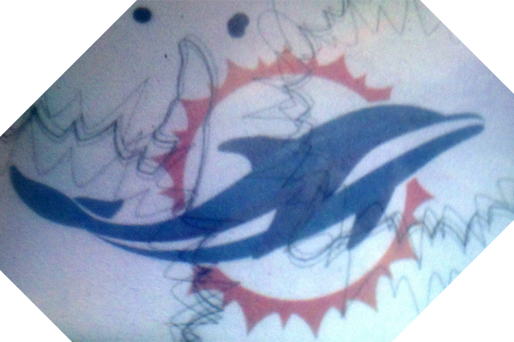
Recently I was presented with some new information about the logo. If I hadn’t been in the exact place and time this would have never come together. The first bit of information is that a Dolphins fan and friend of mine has been showing off this logo that he swore was a sketch of a design for what would become the Dolphins helmet. I didn’t put too much stock in it because it didn’t look anything like any logo I had seen and the Dolphin looked a bit too much like a whale.
Fast forward to last Sunday and I was talking to a friend who happens to work with Nike and was bragging about how they had seen the new uniforms and logo. I don’t want to say too much but their job requires seeing new uniforms well in advance of most people. They of course have to sign a non-disclosure agreement and couldn’t tell me anything except that they didn’t love the logo because the Dolphin looked too much like a whale. That seemed like too much of a coincidence and my friend who had showed me the logo happened to be standing right there. He showed my Nike source the photo on his phone and they flipped out. “How did you get that?!” the source asked. Evidently the logo he has had this whole time is “very very close” to the new logo.
Today I saw my friend again and asked to see the logo again. I took a photo of his phone with my phone and although it’s a terrible picture I am VERY confident that this is a rough draft of the logo. If you look carefully the fins are navy and there are sort of navy accents on the Dolphin. This is a sketch but like I said, I am 95% sure the Dolphins new logo is going to look a lot like the photo above.
Other bits of information I got from my source is that the Dolphins will not have an orange jersey next year and that the Vikings new uniforms are retro and “awesome”. The source seemed to like our uniforms more than the logo and hinted that they were retro, but wouldn’t say much more than that.
Now as a very loyal Dolphins fan I was conflicted about leaking what I believe to be the new logo, but I don’t think any news source would take my friend of a friend story seriously and I don’t think many people will pick up on this. But when the logo comes out I can point to this and say that DolfansNYC broke the logo first! Then again there is a small chance I am totally wrong too. So I guess we will just have to wait and see.
Lastly, I don’t hate the logo. I am a big fan of the stupid helmet on the Dolphin so I will miss that, and yeah it looks a lot like a whale, but it could be a lot worse. I am still pretty excited to see the new uniforms that my source seemed to think would be revealed at the NFL Draft. Ross had to put his stamp on this team and I don’t hate the logo and I am sure five years down the road no matter what the logo looks like we will still all love it. Go Dolphins!


